Friday Inspiration: Paul Strand

Tir A'Mhurain, Outer Hebrides, Scotland, Paul Strand | Mia

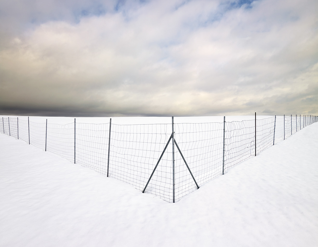
One of the great things about being ‘self-taught’ when it comes to art and photography is that it is a choose your own adventure type of experience. I have, and continue, to explore the things that capture my attention. I will go on deep dives into particular areas until I hit the limit of my attention span and then move on to a different topic. That’s the great part. The not so great part is that this approach leaves large areas not just unexplored but untouched.

I recently rediscovered Paul Strand. I say rediscovered because I’ve certainly heard the name before but couldn’t think of a single iconic image of his when his name recently came up in conversation. I thought that I would spend a few moments this week to have a bit of a read and exploration and share a bit of that here. As an aside, the Metropolitan Museum has a good set of essays on the History of Photography, important movements and photographers including Paul Strand.

Strand was born in 1890 and died in 1976 and as such his photographic career spanned almost all of the 20th century. His early work was very much in the mold of his mentor, Edward J. Steichen – pictoralist – focusing on life in the city. Fascinating to realize that this was at the time when the use of cars were on the rise and so it would have been a period of great change.

Paul Strand: Portfolio Three | Aperture

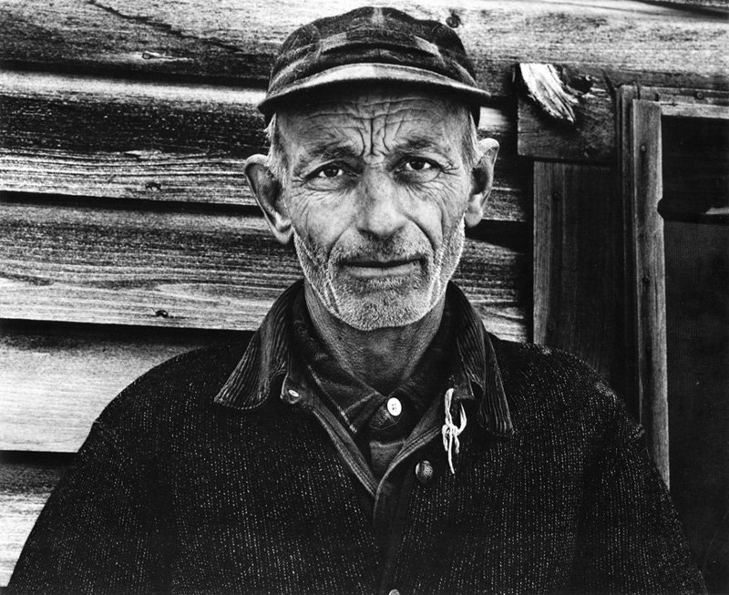
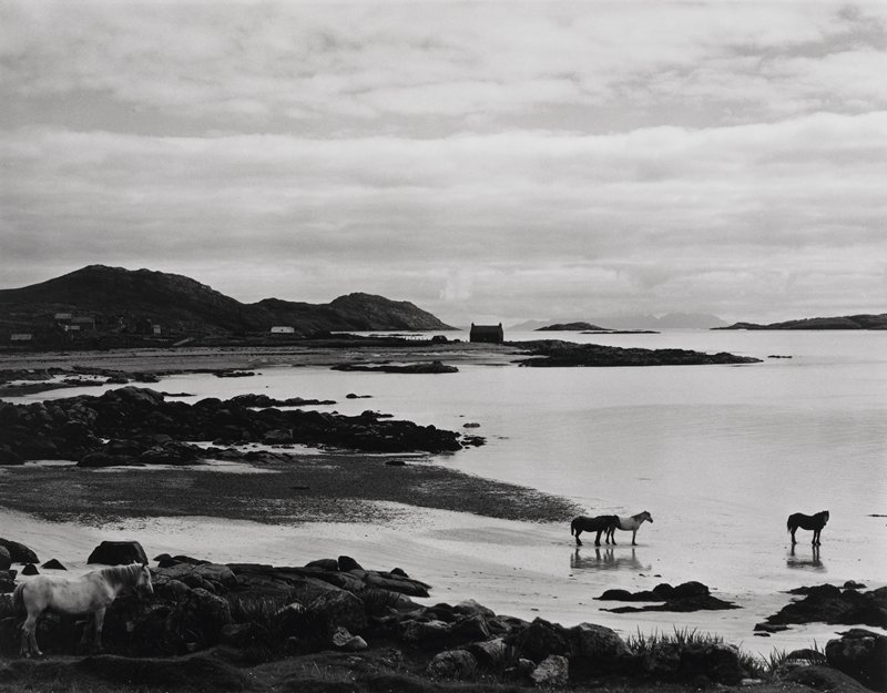
His later work focused more on communities. I’m currently looking for a copy of ‘Time in New England’ to complement the book he created from his time in the Outer Hebrides – Tir A’mhurain: The Outer Hebrides of Scotland.

I was surprised, or rather amazed, at the quality of the reproductions in this book. Digging further I learned that Strand was committed to the print and worked hard to be able develop technical expertise that allowed him to capture images with good tonal range. Learn a little more about Paul Strand in the videos below.

An Alternate to the Folio – Boxes of Prints

Having written about folios as an alternative to a book I thought it was worthwhile pointing to another solution which is the box of prints.

I understand that historically these might have been matted prints but a trend that I am seeing emerge over the last few years is for photographers to offer boxes of prints to their audience. These prints can range from a representative collection of prints spanning a few years, the output from the previous year or just the most recent season.

I was exciting to receive Simon Baxter’s first box set of prints recently and thought I would show you how he pulled this project together as a case study for what excellent could look like.

It’s easy enough to to buy a photo box off the shelf pop your prints in and call it a day but Simon went beyond this. He has his logo embossed in the box lid, the lid itself is hinged and held closed with a small magnet – a nice touch! Inside the box is a colophon/text sheet describing the project and the package of prints. I was impressed – the small details took it to the next level. Take a look in the video below.

Check out more of Simon’s photography at his website here and take a look at his videos at his YouTube channel here.

Friday Inspiration: Jan Töve

When I was recently on my Nordic exploration one of the photographers I came across was Jan Tove.

It never fails to amaze me how many amazing photographers there are in the world – you just have to go digging a little.

Shooting range

I feel like Jan is relatively unknown in the US which is a shame because his work deserves a much wider audience. A professional photographer since 1994, his work explores the intersection of man, nature and society.

I was excited to read that Jan has published 14 books, perhaps more now, and I’m currently on the hunt for a few of these to learn more about his work. From the essay in Faraway/Nearby we learn that Jan had originally risen to prominence taking more traditional landscape photography but made a pivot to explore the intersection and impact of man on the landscape. While this could put him into the ‘New Topographic’ realm of photography with the likes of Robert Adams and Steve Shore I find his work to be more accessible. I have seen the term visual poetry used in a number of places to describe Jan’s photography, I would certainly agree that there is a calm presence in all of his photographs, and looking through Faraway/Nearby again just now, a depth that draws me in. I will continue my hunt for more of his books here in the US but until then check out his website for portfolios of the work presented in the books and enjoy the flip through below of Faraway/Nearby and Night Light.

Friday Inspiration: Miho Kajioka

I’m sat here trying to work out how I came across the work of Miho Kajioka. It took me a few minutes but I think that I’ve reconstructed it. I tend to hopscotch around from a photographer I read about in this book to digging into who else did the book publisher work with and on and on.

I recently came across IIKKI, a collaborative project between a visual artist and a music artist. IIKKI publishes books and pairs them with music releases. What a cool idea. Their latest release is a book from Miho Kajioka paired with music from Ian Hawgood and Craig Tattersall. And we’re off to the races.

Miho was born in Japan and then moved to San Fransisco to study fine art painting, where she was introduced to photography as one of her classes. Miho returned to Japan where she was working as a journalist when the Tsunami devastated the Fukushima area. Miho returned to art and photography to help her process what she was seeing. I’m glad she did!

I have seen her photography described as ‘snapshot’ photography which struck me as odd, since her photographs look nothing like my snapshots! Working in the traditional darkroom to make silver gelatin prints she works her negatives, some more than others, to reveal her vision. I’m fascinated at the moment with trying to reverse engineer Miho’s technical process. How does she achieve those creamy whites and the delicate blacks?

Her work is also giving me insights into my own tastes and how my work could evolve. I like the simplicity in her images. They are frequently paired down to just the essence, often juxtaposing contrasting elements. For me this makes a stronger statement and gives me space to think.

Check out more of Miho’s work at her website here and listen to her describe her journey and her work in the interview below.

A Journey into Bonsai

Rocky Mountain Juniper no. 40

Bonsai is something that I’ve been interested in for a really long time. Bonsai are in essence miniature trees. They can be found on rare occasions in nature, such as the one in the image below, when a seed lodges in soil on a rock (or log!) germinates and grows into a natural bonsai. More commonly bonsai are created by growing trees in containers. Bonsai literally translated means tray planting.

Bonsai really is an art, with the intent to make the trees look as, or perhaps more, beautiful than the counterpart in the wild. All this takes skill, creativity and patience. Bonsai are living things that take time to respond to the shaping, that take time to look ‘natural’. Bonsai trees in museums, arboretums and private collections can be hundreds or years old. One of the trees at the National Bonsai Museum in Washington DC is almost 400 years old and survived the Hiroshima bomb blast. Which makes the artisans that care for them stewards of the trees, taking care of them for the next generation.

Always keen to have a go I dabbled with a few of my own bonsai trees for a while. I don’t really have ‘green fingers’ though and so my bonsai trees ended up being donated to the team at New England Bonsai Gardens. I’m tempted to try again now that I’m older and a little more patient.

Recently I have been enjoying following the work of Anthony Fajarillo, @tonybonsaiko on instagram. He truly is an artist when it comes to training bonsai. To get a sense of his imagination and skill take a look at the windswept juniper before and after in the images below.

Windswept Juniper Before
Windswept Juniper After

I had drifted far from bonsai when ‘The Artisan Cup’ was held in 2015. This competition, really an opportunity to showcase top flight American Bonsai artistry, was the brainchild of Ryan Neil. Ryan is the founder of Bonsai Mirai, where he is really moving the needle for American Bonsai. He is living up to the high Japanese standards he learned during his apprenticeship in his work and expecting the community of craftsmen that provide the essential items such as handmade pots that complete the picture to strive for the same ideal. Get a glimpse of Ryan in action in the two videos below.

I’m disappointed to have missed ‘The Artisan Cup’ and the exhibition guide that accompanied the entries. Take a look behind the scenes in the video below.

The second Artisans Cup was supposed to have been held in Australia in 2020 – we all know how that went – let’s hope that it will be held again in 2025 when it is supposed to be back in the US again.

Looking at bonsai has certainly given me some food for thought and some ideas about how I might photograph full size trees in the wild.

Friday Inspiration: Kenro Izu

We’re still in various shades of lock down here in Connecticut. I certainly won’t be traveling beyond the local area until at least the second half of the year which leaves me wondering what to do to scratch the photography itch. I’m spending time making plans for photography trips and also filling the well by looking at a lot of photography on line and in my ‘library’ of photography monographs.

I’ve been exploring the idea of doing a still life project, something that I’ve thought about over the years and even made some tentative attempts. In thinking about still life projects I came across the work of Kenro Izu and got his book Still Life (it’s out of print so you’ll have to hunt a bit) to explore more.

Kenro was born in Japan and moved to New York City in 1970. After a short period of time working as an assistant he established his own studio. I have struggled to find a comprehensive biography of Kenro – as one might expect each one I’ve read presents a slice of his life that is relevant to the project that is being exhibited or presented. I came to Kenro’s work through his still life portfolio but this is very much one facet of his art life. He has travelled widely to explore the spirituality of Buddhist and Hindu sacred spaces – creating bodies of work in places such as Angkor, Bhutan and Fuzhou.

As I understand it many of these projects were completed using a large format camera that produces 14×20 negatives. What a hulking beast of a camera! The negatives are processed using platinum palladium printing process. Platinum palladium is an interesting process, it results in images with a distinct brown to off white look. The chemistry is UV sensitive which means as long as you stay clear of UV light you don’t need to work in a dark room. Watch Kenro developing a print in the video above.

I understand that Kenro used a medium format digital camera for his project ‘Requiem’. It’s possible to make digital negatives by printing onto Waterproof Silk Screen Positive Film and then developing these in the normal way. An interesting option for those of us that are committed to digital but want to explore more traditional printing techniques.

Check out the interview with Kenro in the videos below and see more of his work on his website here.

Friday Inspiration: Sean Tucker

Photo by Sean Tucker in London, United Kingdom. Image may contain: one or more people and indoor.
Sean Tucker, Way Out

I’ve been reading a lot recently about the algorithm that determines your feed on social media sites such as instagram and YouTube. I was a bit slow to realize that Instagram no longer shows you posts as they appear – in chronological order – but rather in an order that’s determined by a mysterious algorithm.

On YouTube the situation is a little better there are the subscribe and home sections. When I’ve caught up on everything that subscribe to and want to watch I will flick over to the home section and see if there’s anything interesting there. That’s how I found Sean Tucker.

Sean has had an interesting journey. He was a pastor in South Africa until he was 30, when he was asked to leave the church because his views contradicted those of the leadership. He then had to reinvent himself. I can only imagine how it would be to start from scratch after 10+ years of dedication to a particular path.

Fortunately for us Sean had been shooting video and photos on the side to supplement his income from the church and took the opportunity to focus on his photography. He’s pretty candid about his start in photography – it didn’t go exactly as he planned – but has been able to leverage his experience as a pastor to create some very inspirational videos. He’s tried his hand at a number of different genres and seems to be settling into being a street photographer. Sean publishes a book of his best images each year. I was lucky enough to get a copy a few weeks ago. It’s excellent. A quick flip through is below.

It sounds like true ‘street photographers’ bridle a little when that label is applied to Sean. That he’s not a proper street photographer. I suppose I understand it. Sean’s images have a strong sense of light, geometry and graphics. The more that I look at them and use words to describe them they remind me of Jay Maisel’s images – great sense of color, shape and line and perhaps some of Saul Leiter’s photos. Are these street photographers? I think that all three are doing the same thing – wandering around the streets of the city that they live in and taking photos of the things that catch their attention.

Find out more about Sean Tucker by visiting his website, YouTube channel and Instagram profile. Watch Sean in action as he pushes himself out of his comfort zone and does some landscape work in Snowdonia and then shows us how he thinks about post-processing in the videos below.

My 2021 Notebook Stack

I thought I’d try out a video of this set of notebooks check it out:

The smallest of the notebooks that I have is a passport size notebook from Travelers Company. It’s an odd size at 5.2 x 3.8 inches, about the same size as a passport, small enough to easily be able to put in a pocket with you to carry around. You can set it up to have a max of three different inner notebooks at the time I got this notebook I didn’t really see the point and so had a diary as one and a notepad as the other insert.

I somehow got into the notebooks from Field Notes. They are too big for the Travelers company leather cover which was a frustration for me. I eventually decided to forgo the cover and switch to the Field Notes notebooks. They were easier to get in the US at the time. The Field Notes books are pretty interesting with a new design appearing every quarter or so.

I’ve been fortunate enough to visit Vienna several times and somewhere along the time I got introduced to Paper Republic. I had been looking at their Grand Voyager XL planner, an A5 leather cover and notebook set as a replacement for the Moleskine notebooks that I use. By mistake I ordered the Grand Voyager Pocket. Turn out that the Pocket size is the perfect size for me. I can finally use my Field Notes books in a system similar to the Travelers Company notebook. I now use one notebook for a ‘bullet journal’ rapid logging section and then the second for notes and ideas. ‘Collections’ in the Bullet Journal lingo.

When

When I want a little bit more real estate than the Field Notes size books can provide I work in the Baron Fig Confidant notebook. This notebook stays in my desk at home. Ideas get transferred into this from the Field Notes books.

Finally when I really want to stretch out I have this A4 size notebook that I picked up on Amazon. Quite often I’ll go over and over the same topics in several places – a habit that I appear to have. I will press on topics until they yield to my meager understanding.

In addition to these analog notebooks I use Instagram as a digital sketchbook where I try ideas out. I limit my Instagram posts to iPhone only efforts. And I use this blog to document the things that I’m thinking about and looking at.

More on this topic to come.

Friday Inspiration: Brooks Jensen

Brooks Jensen, Winter Trees, Mt Erie, Fidalgo Island, Washington, 2003

When I was thinking about what I had learned in the Portfolio Development class with William Neill, one of the things that I was reflecting on is how much you can learn from the other students. A good group that are freely sharing their previous experiences, understanding and viewpoint can really support your growth.

One of the students in the class turned me on to Lenswork – a magazine that I had never heard of and certainly wasn’t carried in the local bookstores at the time. I eventually ended up getting a subscription so that I could see what it was all about. Lenswork is a bimonthly magazine that emphasizes photographs not gear and is exquisitely printed – book quality printing. From what I understand the emphasis on photographs is very similar to the principals that were at the heart of Aperture Magazine when it was established and under the guidance of Minor White. To see some of the early issues check out this anthology.

The editor, Brooks Jensen, is an accomplished photographer and his work can be found at his personal site, Brooks Jensen Arts. The image above is from Brooks’ first Winter Trees portfolio – you can download a pdf of the portfolio here. I continue to be fascinated by this image – it has a depth to it, a three dimensionality, that I have not experience in any other photograph. I was fortunate enough to be able to get a print of this image when Brooks was still selling individual images and it is even more stunning in the flesh, as it were.

Brooks’ thinking about photography that he shares through his writing and podcast have had a profound impact on my thinking about the ‘photographic art life’. He makes really great points about in his article about what size should editions be, has suggested multiple ways of presenting your work to your audience including, Folios and Chapbooks and additionally was an earlier adopter of PDFs. I have learned a tremendous amount from Brooks and think you would too. Go take at look at Lenswork, Lenswork online and Brooks Jensen Arts. Listen to the interview with Brooks in the interview below.

Virtual Photo Tour: Nostalgia Edition: Part 1 – Yorkshire

Paul Hart: Windy Corner, 2013

Like many of you I’m starting to get itchy feet. 2020 was the first year that I did not get in a plane in a long while and 2021 has started off looking like travel will be limited this year too.

That got me thinking about all the places I would like to visit. So this is the first of what I’m calling ‘virtual photo tours’ where we explore some of the places I want to visit and highlight who might be good companions for our trips. For our first photo tour I wanted to go ‘home’ and explore with a camera places from my past.

First up Yorkshire. I grew up in a very flat part of Yorkshire, on the border of the old East and West Ridings. Paul Hart’s images of The Fens, such as the one above, could have been taken in this area rather than in East Anglia. They really remind me of foggy Sunday mornings driving around to play football against the neighboring village team.

The river Don flows through the village I grew up in. Growing up I heard stories of epic flooding in the local area. Those times seem to have returned as you can see in the footage below.

Let’s head out to the Yorkshire Coast next and take a drive up from Filey to Robin Hood’s Bay, Whitby and finally to Staithes.

I spent all my summers at the beach in Filey and I’m looking forward to returning with my camera soon. My uncles used to keep their fishing boat just to the left of the little hut in the image below.

The Lifeboat Station Project: 12×10 inch Clear Glass Ambrotype by Jack Lowe The view from Filey RNLI Lifeboat Station, 11th June 2017

As places do, Filey has changed a lot since I was a kid. The fishing boats on cobble landing are essentially gone and there is talk of closing the lifeboat station. What a travesty.

View of Filey Bay

The Brigg – the land that juts out into the sea in the image above has lots of possibilities. You have to be careful though – the tide comes in quick and it’s easy to get cut off.

After a stop in Robin Hood’s Bay lets stop at Whitby. I’ve only been to Whitby a few times. It’s famous as the place where Captain Cook learned seamanship and connections with Bram Stoker’s Dracula. It’s also the last stop on the North Yorkshire Moors Railway. When I think of Whitby I think of the breakwaters that guard the entrance of the harbor shown in the image below.

https://www.discoveryorkshirecoast.com/whitby

Adam Karnacz of First Man Photography gives a great tour of the sights of Whitby in his video below and also a tutorial of long exposure seascapes too!

On to Staithes! I’ve never been to Staithes and only know it from the Joe Cornish images of the harbor below. I can wait to visit, especially at different times of year. What a difference a coating of snow makes!

Joe Cornish: Staithes

Listen to Joe talk about the image at the top and how he thinks about preparing the image for print in the video below.

Perhaps we could get Joe Cornish or Adam Karnacz to join us for our coastal adventure or better yet the two of them together they clearly have great chemistry in the video below.

For the final leg of our nostalgia edition photo tour I want to visit Snowdonia. More about that next time.